Andrew Burks
Building systems that help people make sense of data.
Sr. Lead Software Engineer - Full Stack at Capital One. Ph.D. Candidate in Computer Science at the University of Illinois at Chicago.
I work across the full stack on the user-facing side of Capital One Trade Credit, partnering with the team's people leader on product work.

Joined the Capital One Trade Credit Experience team as a full-stack engineer focused on the application's user-facing surfaces.
How I (re)Built This Site
Seven years
The Nervous System Pattern: Persistent Memory for Coding Agents
Promoted to Principal Research Scientist and appointed Director of Decision Sciences Visual Analytics at Epsilon.
Promoted to Senior Staff Research Scientist in the Decision Sciences Visual Analytics group at Epsilon.
transitioned from intern to full-time Senior Visual Analytics Engineer at Epsilon.
Securing Collaborative Work in Wide-band Display Environments
SAGE2 (Scalable Amplified Group Environment) is the de-facto platform to support group work on wide-band display environments. Unlike most web applications, the SAGE environment, due to the nature of its collaborative model, needs a nuanced handling of security aspects. This paper details the security requirements of SAGE2, the Identity and Access Control model that was developed to address those requirements, and the details of the Identity and Access Management system that the SAGE team implemented based on this new model. Further, we present a comparison of this new system with some of the popular collaboration platforms to highlight the uniqueness of SAGE2 integrated with this new Identity and Access Management system.
Traces of Time through Space: Advantages of Creating Complex Canvases in Collaborative Meetings
SAGE2 is a widely known open-source environment for collaborative immersive analytics on large display walls. This paper briefly outlines our group's approach to evolving the SAGE2 software to support existing and future collaborative scientific exploration workflows through the application of Artificial Intelligence in Immersive Analytics.
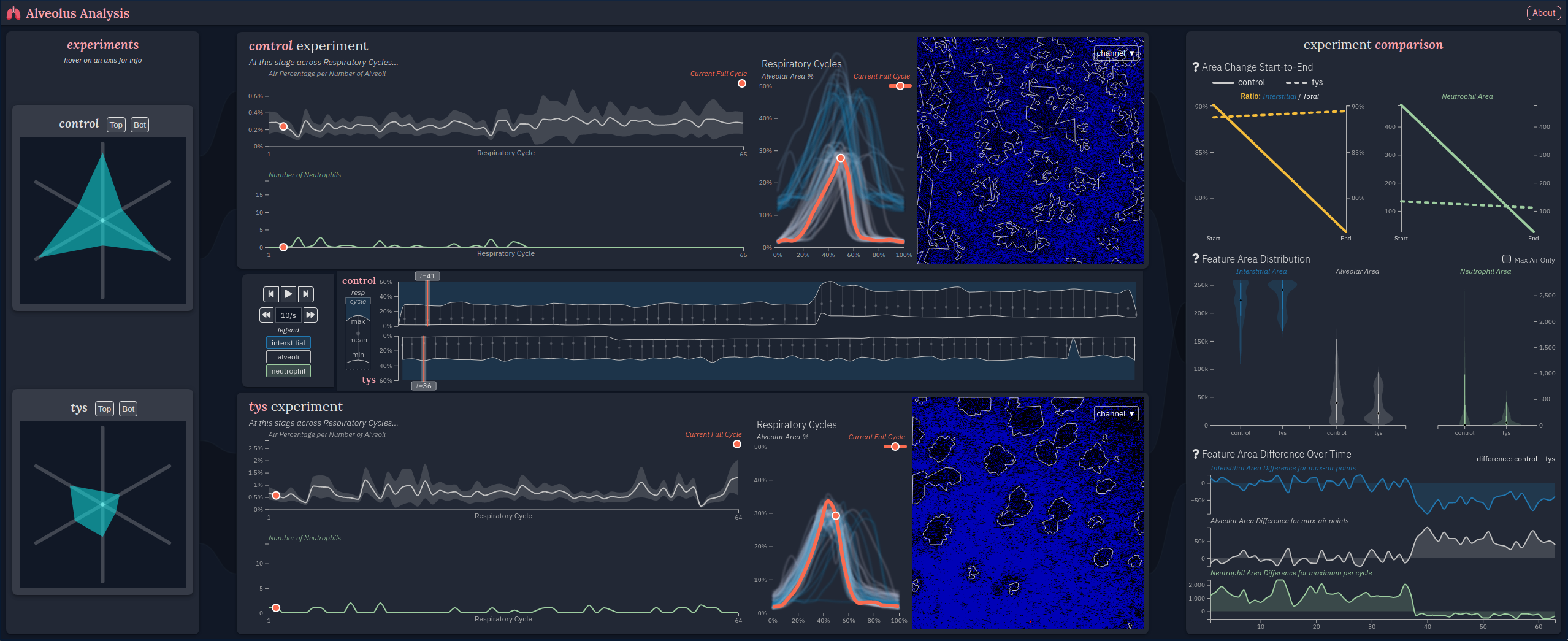
Alveolus Analysis: A Web-based Tool to Analyze Lung Intravital Microscopy
Acute lung injury and the acute respiratory distress syndrome (ARDS) are characterized by pulmonary inflammation, reduced endothelial barrier integrity and filling of the alveolar space with protein rich edema fluid and infiltrating leukocytes. Animal models are critical to uncovering the pathologic mechanisms of this devastating syndrome. Intravital imaging of the intact lung via two photon intravital microscopy has proven a valuable method to investigate lung injury in small rodent models through characterization of inflammatory cells and vascular changes in real time. However, respiratory motion complicates the analysis of these time series images and requires selective data extraction to stabilize the image. Consequently, analysis of individual alveoli may not provide a complete picture of the integrated mechanical, vascular and inflammatory processes occurring simultaneously in the intact lung. To address these challenges, we developed a web-based visualization application named Alveolus Analysis to process, analyze and graphically display intravital lung microscopy data. RESULTS: The designed tool takes raw temporal image data as input, performs image preprocessing and feature extraction offline, and visualizes the extracted information in a web-based interface. The interface allows users to explore multiple experiments in three panels corresponding to different levels of detail: summary statistics of alveolar/neutrophil behavior, characterization of alveolar dynamics including lung edema and inflammatory cells at specific time points, and cross-experiment analysis. We performed a case study on the utility of the visualization with two domain experts and they found the tool useful because of its ability to preprocess data consistently and visualize information in a digestible and informative format. CONCLUSIONS: Application of our software tool, Alveolus Analysis, to intravital lung microscopy data has the potential to enhance the information gained from these experiments and provide new insights into the pathologic mechanisms of inflammatory lung injury.

Andrew's React Basics
A mental model for React that scales to large applications like SAGE3. Covers foundational definitions of overloaded terms like 'state' and 'instance' as used in this context.
Slate Gun Deaths Visualization
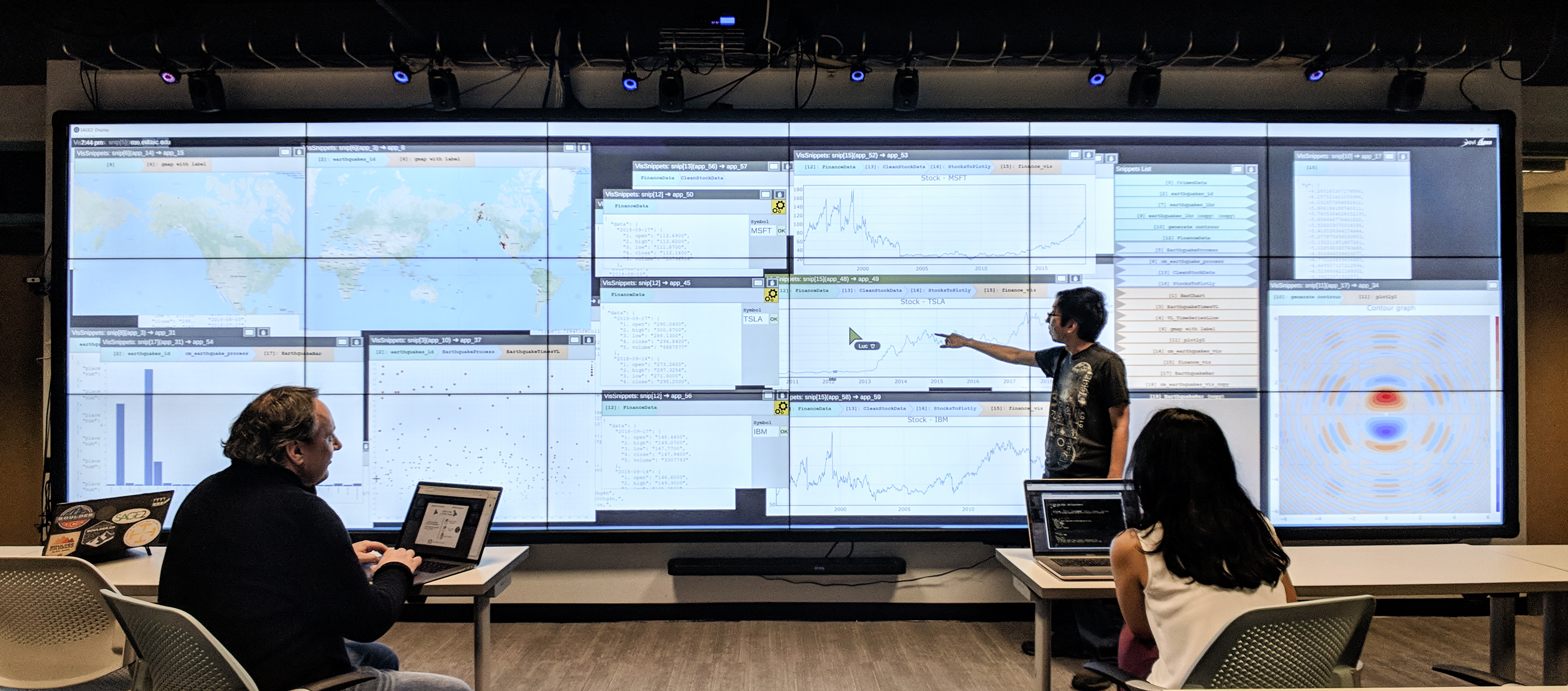
VisSnippets: A Web-based System for Impromptu Collaborative Data Exploration on Large Displays
The VisSnippets system is designed to facilitate effective collaborative data exploration. VisSnippets leverages SAGE2 middleware that enables users to manage the display of digital media content on large displays, thereby providing collaborators with a high-resolution common workspace. Based in JavaScript, VisSnippets provides users with the flexibility to implement and/or select visualization packages and to quickly access data in the cloud. By simplifying the development process, VisSnippets removes the need to scaffold and integrate interactive visualization applications by hand. Users write reusable blocks of code called 'snippets' for data retrieval, transformation, and visualization. By composing dataflows from the group's collective snippet pool, users can quickly execute and explore complementary or contrasting analyses. By giving users the ability to explore alternative scenarios, VisSnippets facilitates parallel work for collaborative data exploration leveraging large-scale displays. We describe the system, its design and implementation, and showcase its flexibility through two example applications.
Vissnippets: A Web-based System for Impromptu Collaborative Data Exploration on Large Displays
The VisSnippets system is designed to facilitate effective collaborative data exploration. VisSnippets leverages SAGE2 middleware that enables users to manage the display of digital media content on large displays, thereby providing collaborators with a high-resolution common workspace. Based in JavaScript, VisSnippets provides users with the flexibility to implement and/or select visualization packages and to quickly access data in the cloud. By simplifying the development process, VisSnippets removes the need to scaffold and integrate interactive visualization applications by hand. Users write reusable blocks of code called "snippets" for data retrieval, transformation, and visualization. By composing dataflows from the group's collective snippet pool, users can quickly execute and explore complementary or contrasting analyses. By giving users the ability to explore alternative scenarios, VisSnippets facilitates parallel work for collaborative data exploration leveraging large-scale displays. We describe the system, its design and implementation, and showcase its flexibility through two example applications.
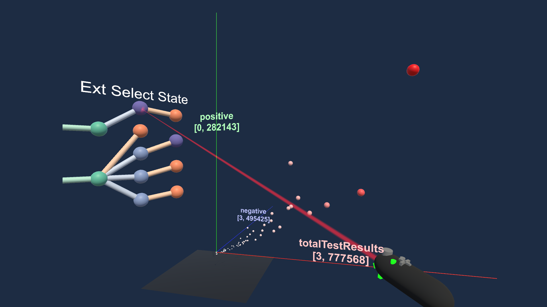
Mixed-Platform Visual Data Exploration using VisSnippets
A Unity VR application that extends the VisSnippets collaborative visual data exploration system to immersive 3D environments. Demonstrates declarative data operations (VegaLite charts, external selections) that bridge a Node.js analysis backend to a Unity VR client via REST API.
CS528 Project 2 Proposal
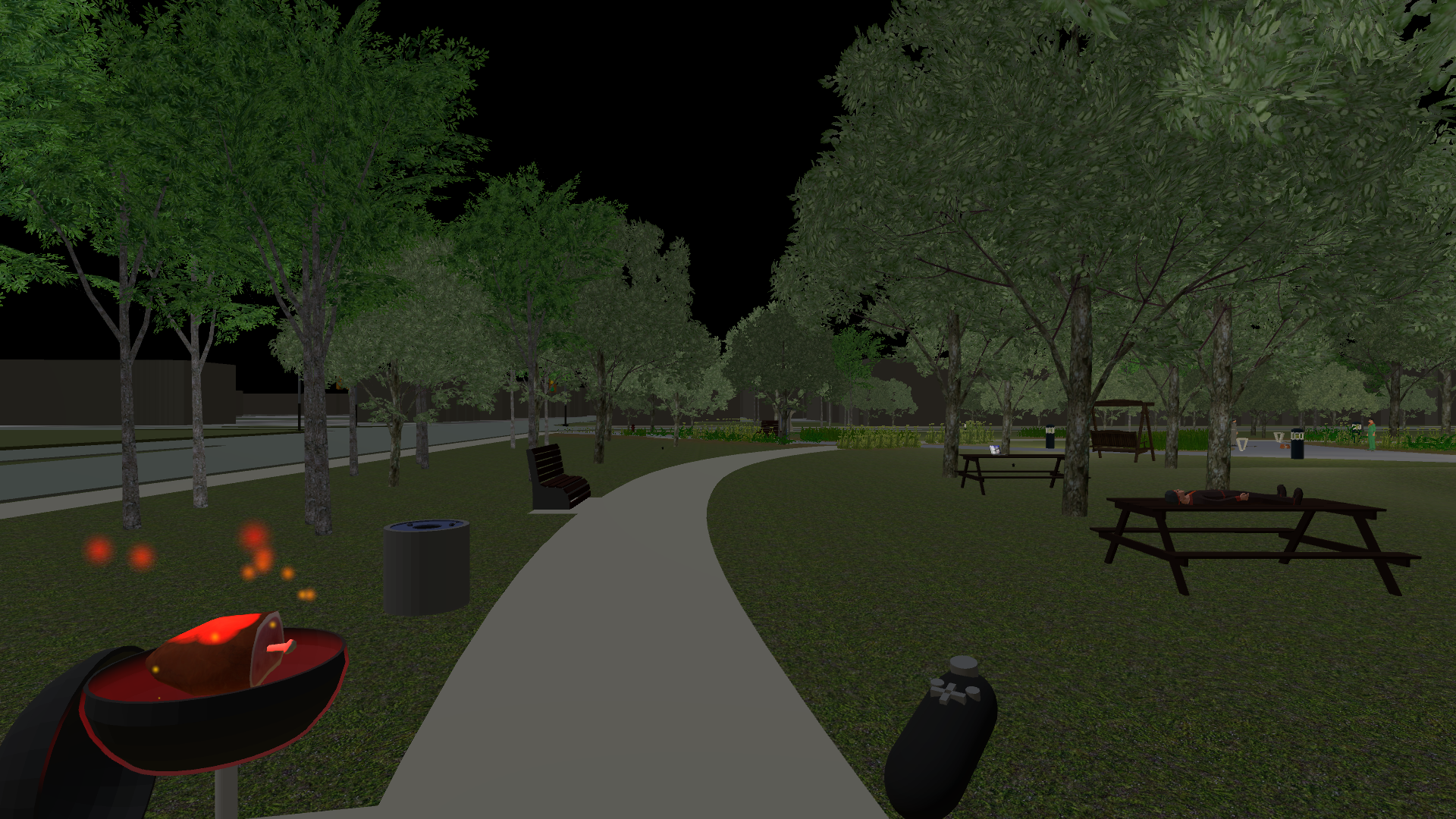
CS528 Project 1
A Unity VR application set in the UIC Grove that demonstrates two explicit interactions: controlling a grill and a sprinkler system. The environment features animated vehicles, day/night cycle with calculated sun positions, and spatialized audio throughout.
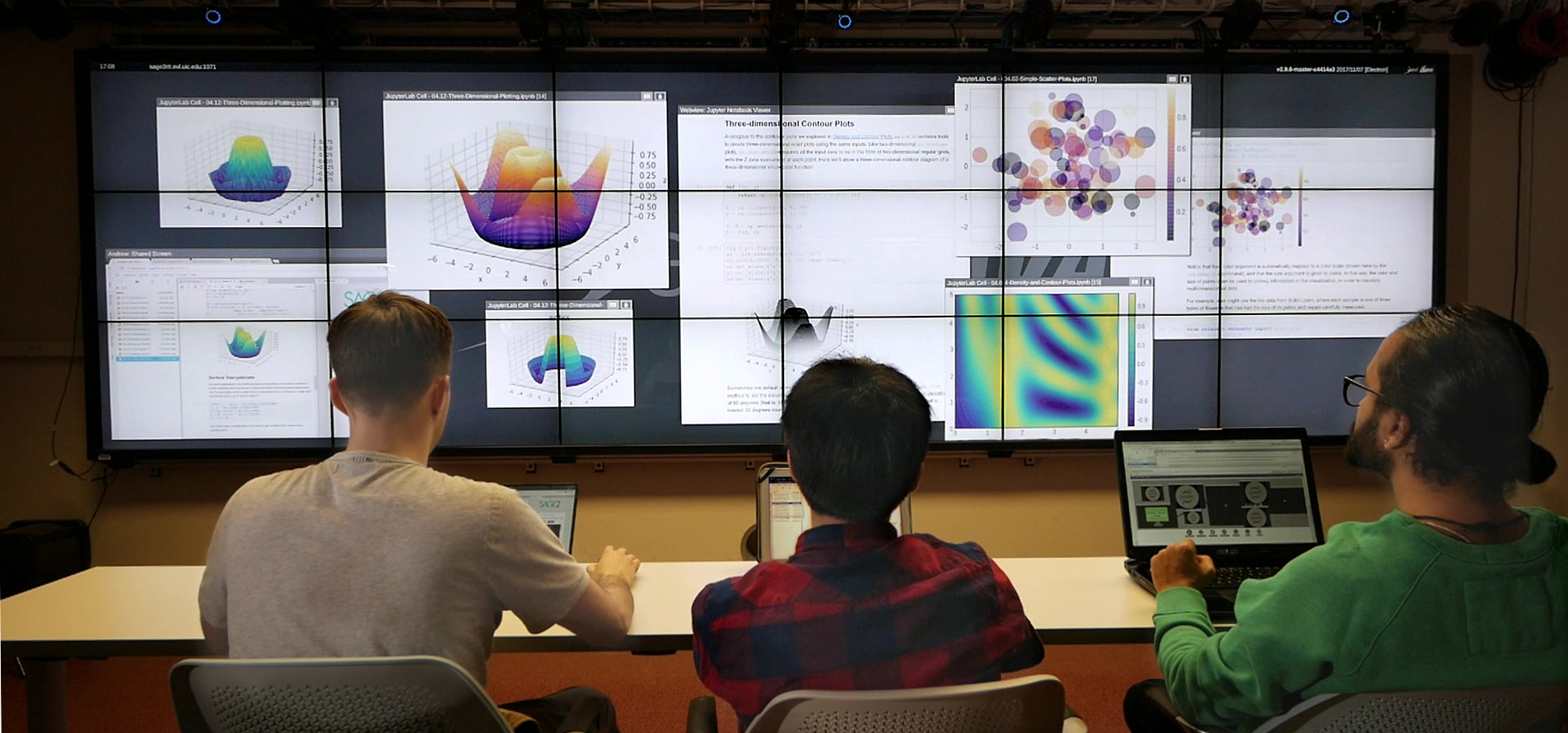
SAGE2 + JupyterLab Integration
To better integrate existing data science workflows into the SAGE2 collaborative experience, we provide a SAGE2 plugin for JupyterLab. The plugin supports sharing both static notebooks, as well as dynamically updating cell content to SAGE2. A user simply connects to one or more SAGE2 server by URL, and can start sharing their Jupyter Notebook content. Shared notebooks are rendered by Jupyter nbviewer as static web-pages on the SAGE2 wall. Shared notebook cell image output is sent as an image to SAGE2 and dynamically updates every time that a cell is run.
Usage Patterns of Wideband Display Environments in E-science Research, Development and Training
SAGE (the Scalable Adaptive Graphics Environment) and its successor SAGE2 (the Scalable Amplified Group Environment) are operating systems for managing content across wideband display environments. This paper documents the prevalent usage patterns of SAGE-enabled display walls in support of the e-Science enterprise, based on nearly 15 years of observations of the SAGE community. These patterns will help guide e-Science users and cyberinfrastructure developers on how best to leverage large tiled display walls, and the types of software services that could be provided in the future.
Joined Epsilon as a data visualization intern.
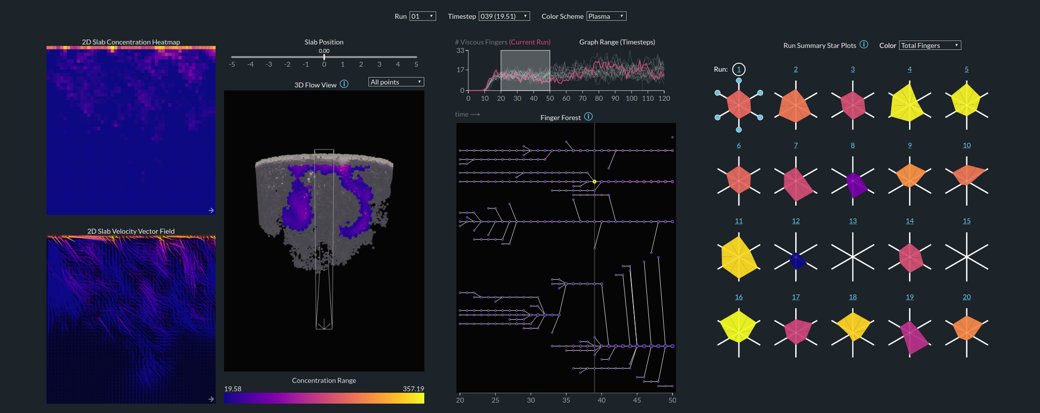
Details-First, Show Context, Overview Last: Supporting Exploration of Viscous Fingers in Large-Scale Ensemble Simulations
Visualization research often seeks designs that first establish an overview of the data, in accordance to the information seeking mantra: “Overview first, zoom and filter, then details on demand”. However, in computational fluid dynamics (CFD), as well as in other domains, there are many situations where such a spatial overview is not relevant or practical for users, for example when the experts already have a good mental overview of the data, or when an analysis of a large overall structure may not be related to the specific, information-driven tasks of users. Using scientific workflow theory and, as a vehicle, the problem of viscous finger evolution, we advocate an alternative model that allows domain experts to explore features of interest first, then explore the context around those features, and finally move to a potentially unfamiliar summarization overview. In a model instantiation, we show how a computational back-end can identify and track over time low-level, small features, then be used to filter the context of those features while controlling the complexity of the visualization, and finally to summarize and compare simulations. We demonstrate the effectiveness of this approach with an online web-based exploration of a total volume of data approaching half a billion seven-dimensional data points, and report supportive feedback provided by domain experts with respect to both the instantiation and the theoretical model.
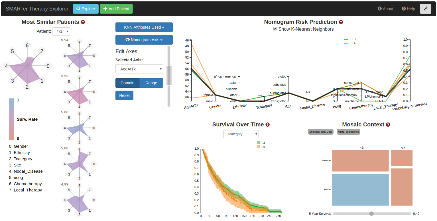
Precision Risk Analysis of Cancer Therapy with Interactive Nomograms and Survival Plots
We present the design and evaluation of an integrated problem solving environment for cancer therapy analysis. The environment intertwines a statistical martingale model and a K Nearest Neighbor approach with visual encodings, including novel interactive nomograms, in order to compute and explain a patient's probability of survival as a function of similar patient results. A coordinated views paradigm enables exploration of the multivariate, heterogeneous and few-valued data from a large head and neck cancer repository. A visual scaffolding approach further enables users to build from familiar representations to unfamiliar ones.
Finished data visualization internship at United Airlines.
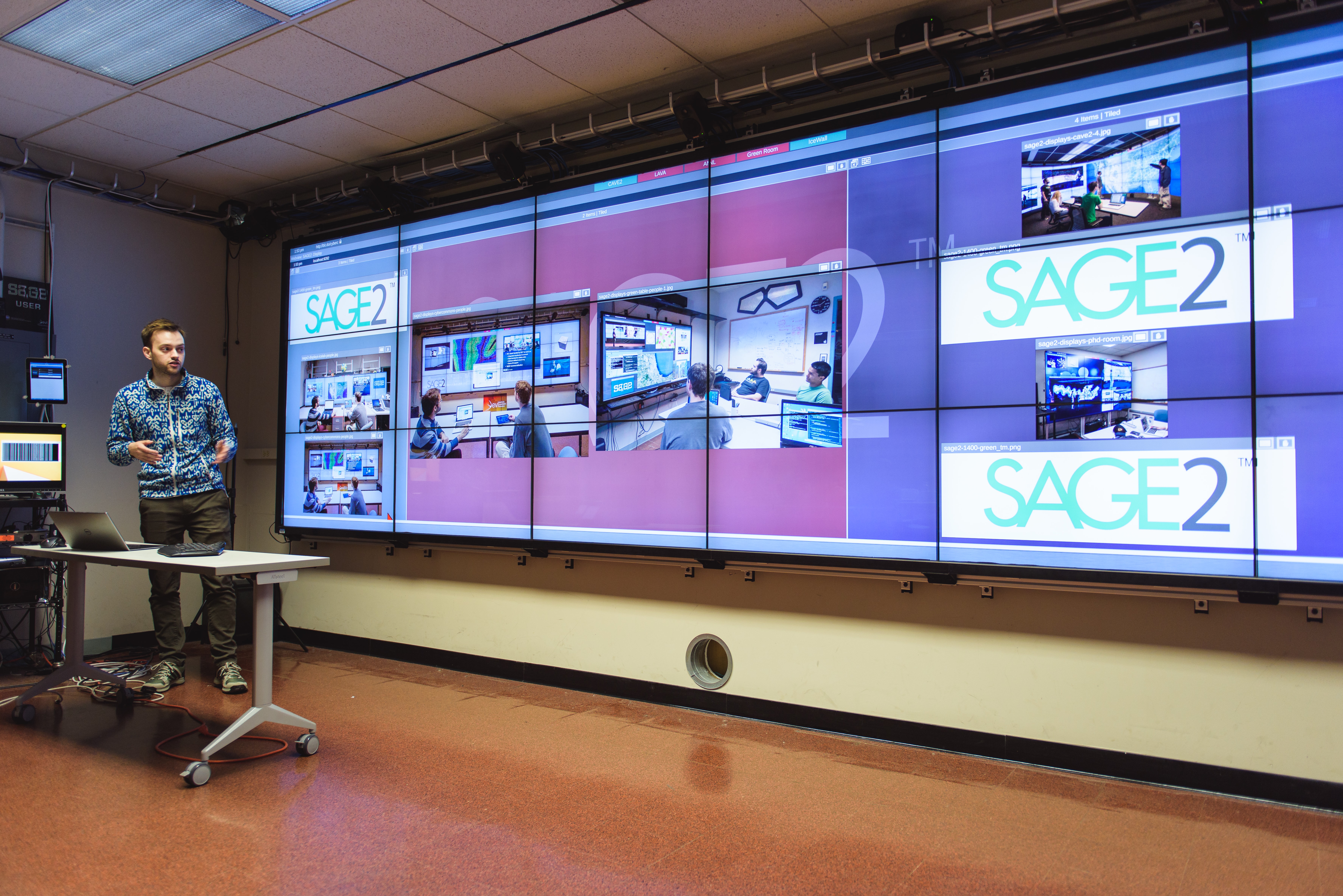
SAGE2 Partitions
While SAGE2 allows users the complete freedom to organize their content, SAGE2 Partitions aim to provide optional structure to the organization. SAGE2 partitions can act as divisions of the screen space, deforming their neighbors when resized. The Partitions can be 'un-snapped' to allow for free movement, becoming a simple grouping of applications. Partitions can be 'tiled' organizing the content within into a grid. As content is added or removed from a Partiton, the groupings are dynamically updated and content dynamically rearranged. Click-and-drag interaction can be used both to create new Partitions in an empty space and essentially select apps to grab, or to 'cut' existing Partitions to divide the size and content.
Started data visualization internship at United Airlines.
Began PhD program at the Electronic Visualization Laboratory, University of Illinois at Chicago.
Details-first, Show Context, Overview Last: Supporting Exploration of Viscous Fingers in Large-scale Ensemble Simulations
In this paper, we present a details-first visual encoding strategy designed to address the challenge of exploring and comparing large-scale ensemble simulations. This approach, grounded in a series of design studies with climate scientists, emphasizes individual simulation runs as the primary unit of analysis while simultaneously providing contextual information about the ensemble as a whole.
Precision Risk Analysis of Cancer Therapy with Interactive Nomograms and Survival Plots
We present the design and evaluation of an integrated problem solving environment for cancer therapy analysis. The environment intertwines a statistical martingale model and a K Nearest Neighbor approach with visual encodings, including novel interactive nomograms, in order to compute and explain a patient's probability of survival as a function of similar patient results. A coordinated views paradigm enables exploration of the multivariate, heterogeneous and few-valued data from a large head and neck cancer repository. A visual scaffolding approach further enables users to build from familiar representations to unfamiliar ones. Evaluation with domain experts show how this visualization approach and set of streamlined workflows enable the systematic and precise analysis of a patient prognosis in the context of cohorts of similar patients. We describe the design lessons learned from this successful, multi-site remote collaboration.
Earned BS in Computer Science from the University of Illinois at Chicago.
MC2: Mining Factory Pollution Data through a Spatial-Nonspatial Flow Approach
Mini Challenge 2 of the VAST Challenge 2017 focused on a small industrial area south of the fictional Mistford preserve, specifically around four manufacturing factories. Our main goal was to develop a visual analytics tool to explore the spatio-temporal chemical readings and wind data. Specifically, we wanted to determine which factories were responsible for emitting which chemicals and to determine the performance of the nine sensors in the area. In order to help achieve this goal, we developed a web-based application that utilizes interactive visualizations and path line analysis for revealing sensor errors and chemical reading spikes, along with pinpointing the possible sources of chemical reading spikes.
MC1: A Bespoke Analysis Tool for Spatio-temporal Park Traffic Data
This paper describes a web-based traffic data analysis tool developed for the VAST 2017 Mini Challenge 1. The tool consists of two linked heat maps which allow for the inspection of daily activity for vehicles, as well as a histogram which allows for the analysis of total time spent by vehicles in the park. Combined, these views allow for the analysis of both spatial and temporal patterns in the park preserve.
MC3: A Web-Based Interactive Image Explorer for Temporal Analysis of Satellite Images
Our web-based image analysis tool for the VAST 2017 Mini-Challenge 3 combines small multiple views of satellite images, linked semantic zooming and image intensity histograms, along with filter controls. The resulting tool allow users to interactively analyze spatio-temporal changes in the preserve area.
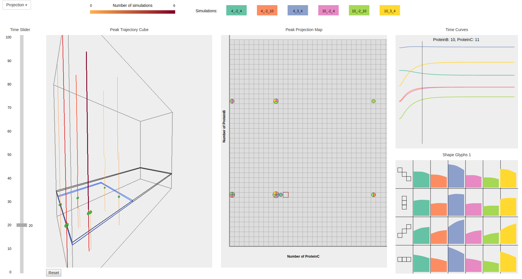
Visualizing ensemble time-evolving probability landscapes of stochastic networks
The computational study of the dynamic and stochastic natures of gene regulatory networks is a challenging topic in systems biology. Visualizing ensemble time-evolving probability landscapes of stochastic gene networks can further biologists’ understanding of phenotypic behavior associated with specific genes. We present a web-based visual analysis tool for the exploration of peak distributions over state space and simulation time in such stochastic networks, and the comparison of peak distributions between multiple simulations. Our approach combines multiple linked views to capture ensemble time-evolving probability landscapes. A peak trajectory cube provides users an overview of peak spatiotemporal distributions between six simulations. A peak projection map shows the exact peak locations of multiple simulations at the user selected time. At a more detailed level, users can inspect a particular state in the peak projection map to view for each simulation both the probability values over time, and the local probability landscape shapes. This information is displayed in a small multiple using two glyphs: profile glyphs and arrow glyphs. The arrow glyph indicates that a state is a peak when all the glyph eight arrows point towards the glyph center. In the figure, a disagreement between the arrow glyphs and the peak projection map demonstrates that probability distributions over genes in this system are not independent of each other. Our visual analysis tool allows bioinformatics researchers to explore and compare the time evolving changes of probability landscapes from multiple simulations efficiently, without running many small scripts and computing all characteristics separately.
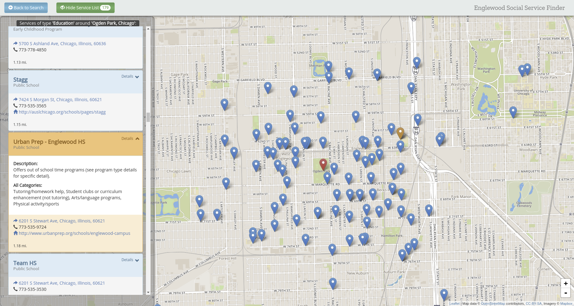
Context-Aware Visualization of Englewood Social Services
The Englewood Data Hub (EDH) is a project that brings together both crowdsourced and public data surrounding the Englewood area into a single place.<br>The EDH Resource Directory makes use of the crowdsourced service and school data to display an interactive map with their locations. Its user interface (UI) allows for an exploratory experience that offers filtering of services by names and type and displays detailed information about the services available in Englewood. The EDH Analytics Tool combines the crowdsourced service and school data with public data sets to display visualizations; specifically, the public datasets used are 2010 Census data along with Vacant Lot and Crime data from the Chicago Data Portal. The Englewood Data Hub has been developed by a group of researchers at the Electronic Visualization Laboratory, University of Illinois at Chicago under the direction of Prof. G. Elisabeta Marai. Team members include EVL research experience undergraduate students (REUs): Andrew Burks, Joshua Castor, and Isabel Lindmae. This project is funded by the The Joseph and Bessie Feinberg Foundation and the University of Illinois at Chicago.
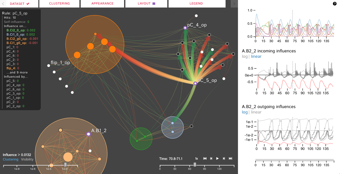
Dynamic Influence Networks for Rule-Based Models
We introduce the Dynamic Influence Network (DIN), a novel visual analytics technique for representing and analyzing rule-based models of protein-protein interaction networks. Rule-based modeling has proved instrumental in developing biological models that are concise, comprehensible, easily extensible, and that mitigate the combinatorial complexity of multi-state and multi-component biological molecules. Our technique visualizes the dynamics of these rules as they evolve over time. Using the data produced by KaSim, an open source stochastic simulator of rule-based models written in the Kappa language, DINs provide a node-link diagram that represents the influence that each rule has on the other rules. That is, rather than representing individual biological components or types, we instead represent the rules about them (as nodes) and the current influence of these rules (as links). Using our interactive DIN-Viz software tool, researchers are able to query this dynamic network to find meaningful patterns about biological processes, and to identify salient aspects of complex rule-based models. To evaluate the effectiveness of our approach, we investigate a simulation of a circadian clock model that illustrates the oscillatory behavior of the KaiC protein phosphorylation cycle.
Dynamic Influence Networks for Rule-based Models
We introduce the Dynamic Influence Network (DIN), a novel visual analytics technique for representing and analyzing rule-based models of protein-protein interaction networks. Rule-based modeling has proved instrumental in developing biological models that are concise, comprehensible, easily extensible, and that mitigate the combinatorial complexity of multi-state and multi-component biological molecules. Our technique visualizes the dynamics of these rules as they evolve over time. Using the data produced by KaSim, an open source stochastic simulator of rule-based models written in the Kappa language, DINs provide a node-link diagram that represents the influence that each rule has on the other rules. That is, rather than representing individual biological components or types, we instead represent the rules about them (as nodes) and the current influence of these rules (as links). Using our interactive DIN-Viz software tool, researchers are able to query this dynamic network to find meaningful patterns about biological processes, and to identify salient aspects of complex rule-based models. To evaluate the effectiveness of our approach, we investigate a simulation of a circadian clock model that illustrates the oscillatory behavior of the KaiC protein phosphorylation cycle.
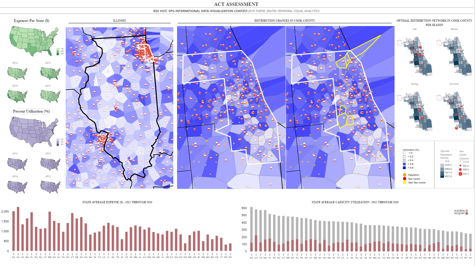
Multi-scale Voronoi-based ACT Assessment
Our contest submission aimed to develop a static visual representation that shows how geographic and seasonal changes in the availability of the ACT test affects nearby or adjacent testing sites, by moving students or assessments, changing dates, or some other strategy. The Voronoi visualization (Top Middle) encodes test center distribution at regional level (Illinois) by partitioning each region based on distances to test centers. The Voronoi cell intensity is mapped to Assigned/Capacity; the darker the cell, the higher demand in that region.
Interactive Exploration and Tracking of Ensemble Viscous Fingers
Details-First, Show Context, Overview Last: We introduce a novel visualization approach for ensemble data that follows a details-first, show-context, overview-last progression. This approach is designed to address the challenge of exploring large-scale scientific simulations where researchers must understand individual simulation runs while also grasping the broader behavior of the entire ensemble.